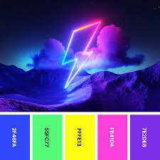
Choosing the Best Color Combinations for Your LED Neon Sign

Choosing the Best Color Combinations for Your LED Neon Sign
When creating your sign, selecting your preferred color combination is arguably the most fun part! The right colors can set the tone, convey your message clearly, and make your sign stand out whether it’s for your business, event, home, or anything in between. Here’s how to choose the best color combinations for your LED sign.
1. Understand the Mood You Want to Convey
Colors evoke emotions, and choosing the right combination can help you set the mood for your space. For example:
- Warm colors like Deep Red, Bright Orange, and Golden Yellow are energetic and inviting, perfect for creating a lively atmosphere in restaurants or bars.
- Cool colors such as Pale Blue, Aqua, and Pale Purple are calming and sophisticated, ideal for spas, offices, or bedrooms.
- Neutral tones like Cool and Warm White provide a clean, modern look, great for businesses aiming for a minimalist or professional appearance.
2. Consider the Space
The environment where your LED sign will be displayed plays a crucial role in determining the best color combination. If your sign’s going in a dimly lit space, bright colors like Cool White, Aqua, or Pale Blue will pop and bring a freshness to the room. Conversely, if the sign is going outside, more vibrant colors like Bright Red, Lamington Pink, or Bright Blue will stand out more.
3. Contrasting Colors
Using contrasting colors – those that are opposite each other on the color wheel – can create a striking look. For example:
- Bright Red and Deep Green can evoke a festive vibe, perfect for holiday-themed signs.
- Bright Blue and Bright Orange offer a bold, eye-catching contrast, ideal for businesses looking to make a statement.
- Pale Purple and Bright Yellow bring a creative and vibrant energy, suitable for artistic or creative spaces.
4. Monochromatic Palettes
A monochromatic color scheme uses different shades and tints of a single color. This approach can create a sophisticated and cohesive look. For instance, a sign using varying shades of blue (Pale and Deep blue) can look modern and sleek, while different tints of pink (Pale and Lamington Pink) can add a playful touch.
5. Accent Colors
If you want your sign to have a focal point, consider using an accent color. This could be a bold, bright color that stands out against a more neutral or subdued primary color. For example, a predominantly white sign with a pop of Bright Red or Bright Yellow can draw attention to a specific part of your message or design.
6. Experiment with Your Colors
With LED signs, you’re not limited to traditional neon colors. Experiment with different color combinations that match your brand, décor, or personal style. Mixing unexpected colors can result in a unique, memorable, and instagrammable design.
Selecting the perfect color combination for your sign is all about balancing aesthetics, visibility, and the mood you want to create. Whether you opt for a bold, contrasting palette or a subtle, monochromatic scheme, the right colors can transform your sign into a true work of art. Use our custom neon sign builder tool to explore our color range in context to your design, or upload your design and let us know which colors you’d like for a free quote.


